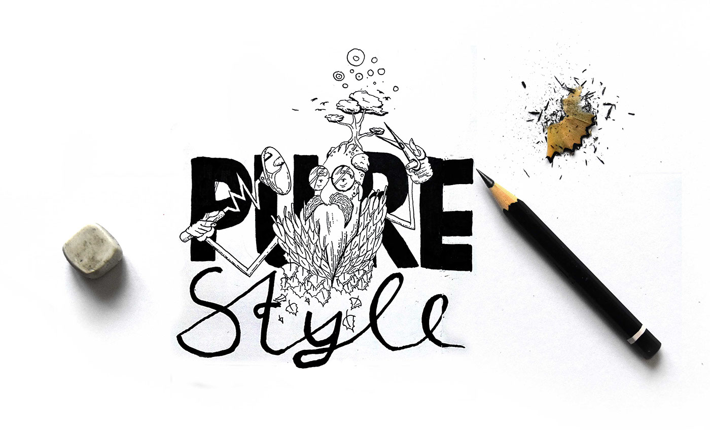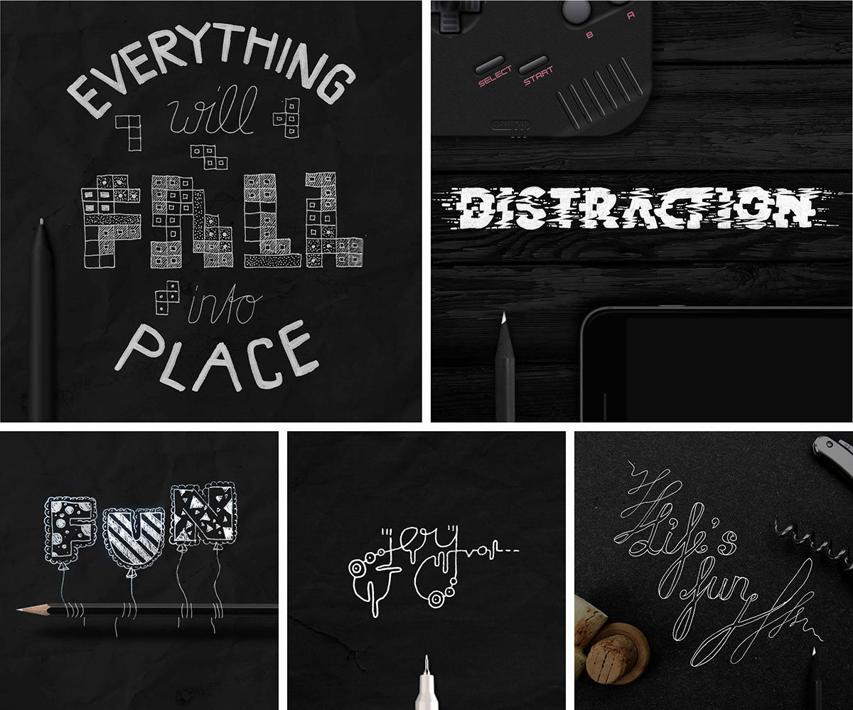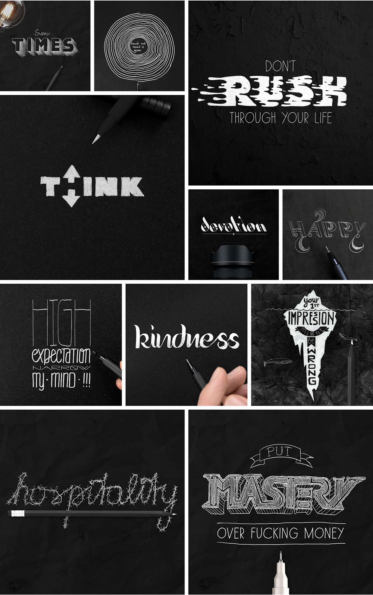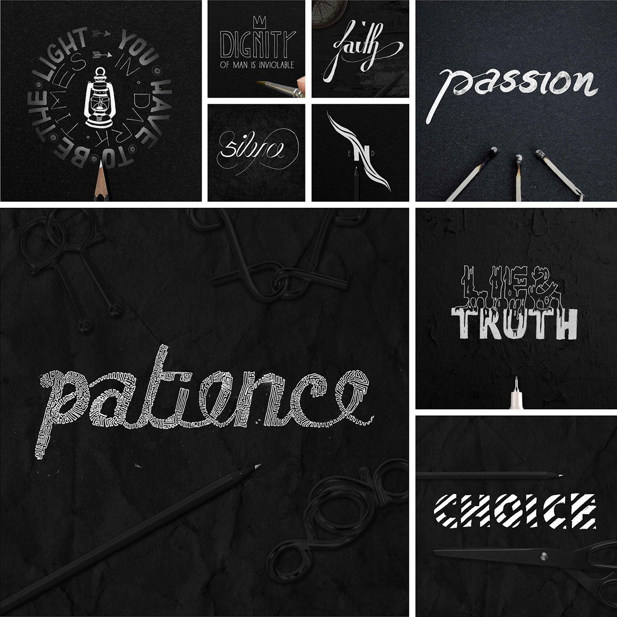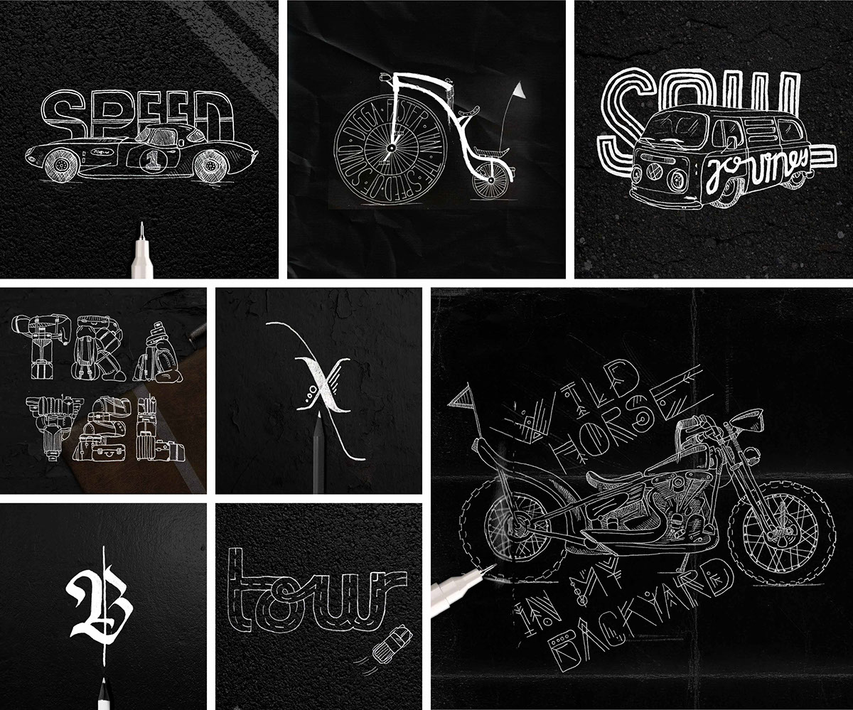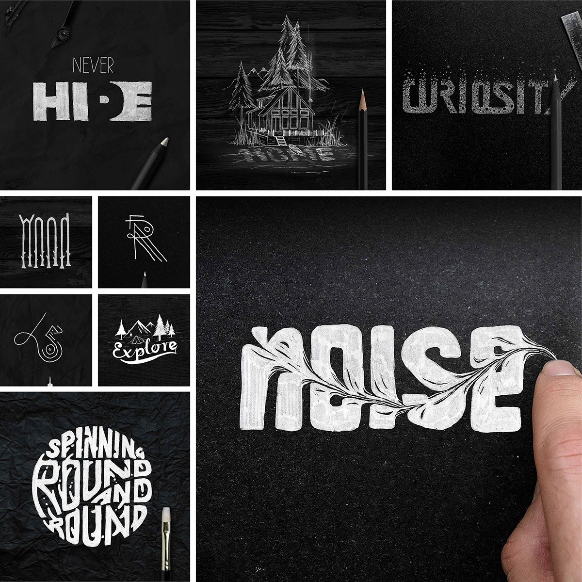
I’ve always been a sucker for hand-drawn typography, but what I love about Christoph Gey’s series is that he isn’t afraid to explore and try out a plethora of different styles. These were all done over the course of three months during Christoph’s lunch breaks or when he couldn’t sleep. (Note to Self: You can always make time.) It takes a lot of trial and error combined with a creative eye for unique and interesting word plays to pull off some of his more intricate effects. Each piece is truly different from the last and takes on it’s own theme with distinct characteristics. I love that although he presents his work in a way that is very clean and refined, each piece still maintains that raw, hand-drawn feeling by using a trusty old pen and paper instead of jumping straight to the computer.